Pages

November 19, 2012

Our New Art Gallery

When I decided to make my husband's photography a more prominent feature in our home, I transformed our main hallway into an art gallery.

To bring a final touch to this space, I named our hallway.  After all, doesn't every gallery have a name?  I went out on a creative limb and named it....Fiorucci Gallery.  My creativity sometimes astounds me.

I found the letters at our local craft store.  It didn't matter that they weren't the same color as I knew I would be painting them black anyway.  
The letters weren't on sale, and I had to pay full retail for them (those who know me just did a collective "GASP!").  The cost came to $28.00.

I spray painted the letters, using matte black paint, which I had around the house.


Here are the tools needed to hang the letters.


Using the painter's tape, I marked where I wanted the letters to hang on the wall.


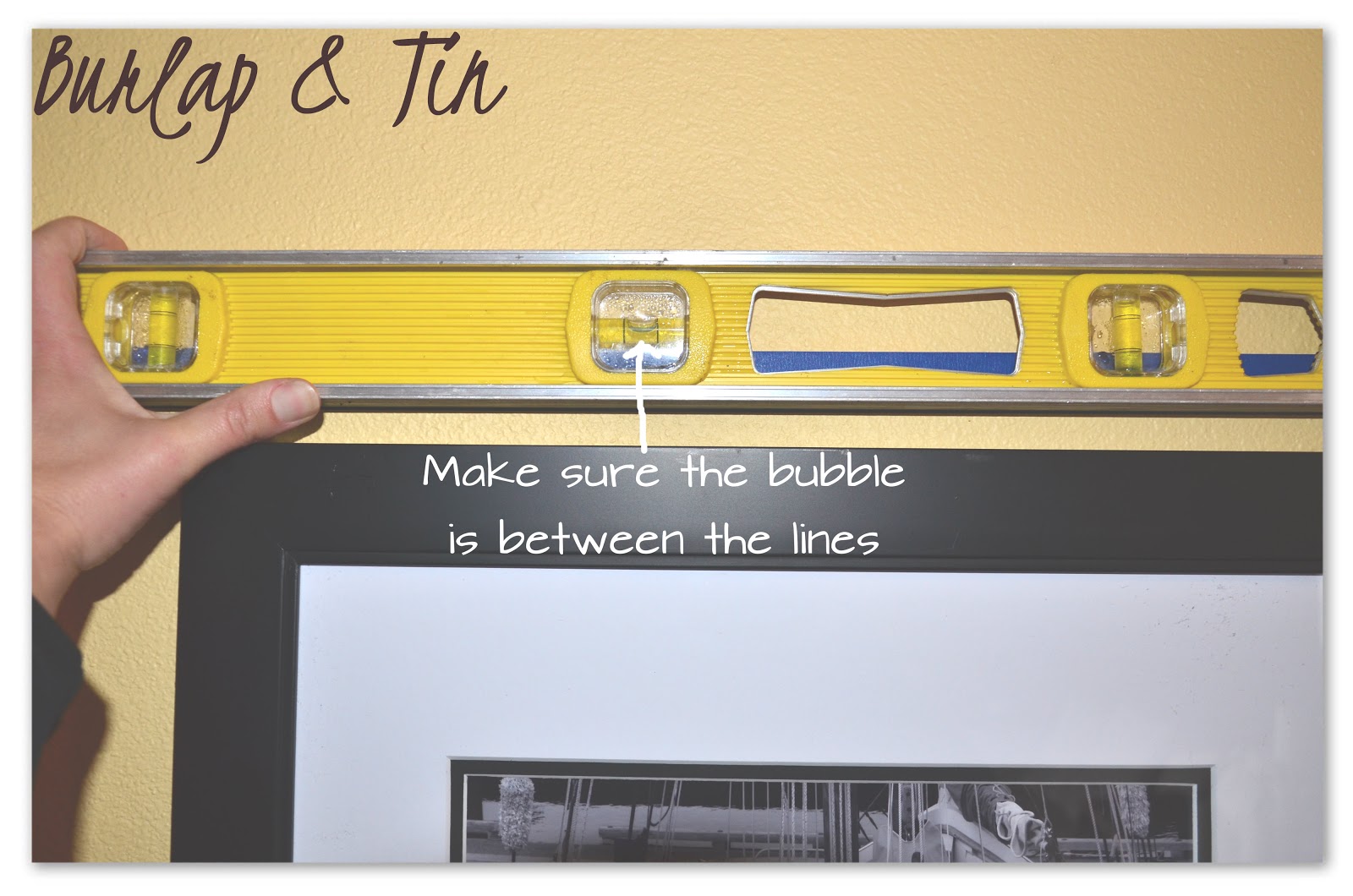
Using the level, I made sure the tape was perfectly straight.  The perfectly-straight-tape will be my guide to ensuring I will have perfectly-straight-letters. 


The letters did not come with a way to hang them on the wall.  Rather than use tape on the wall, I drilled a tiny hole in which the head of a brad nail (finishing nail) could fit.


Once the hole was drilled, I placed the head of the brad nail into the hole and pushed it in as far as it would go.


Starting at the far left, I hung the first letter.  I wanted the "F" and the "G" to be offset just a smidgen from the other letters.  The two larger letters required me to hang a nail and use a hammer.


Second, I placed the last letter to the farthest right.  By using brad nails on the back of the smaller letters, I only had to push them into the wall just as you would a tack.

I worked my way toward each end alternating between words to ensure the spacing would come out correctly.  The last letter to be hung is the letter "G".


TA DA!  The finished project!


A simple idea that gives this space a finished look.


November 9, 2012

Inspiring Spaces

It's time for some weekend inspiration!

Below are just a few of my favorite spaces I stumbled upon this week.


I love the simplicity of the black and white. 
The faux fur on the chair brings a comfy element against the starkness of the white.


This is a perfect example of combining two spaces. 
The yellow on the wall is echoed in the next room with the yellow chair. 
The cubed space on the far wall is repeated in how the pictures are hung on the yellow wall. 


Not only do I love the color of the cushions, I love how it ties in perfectly with the trim of the house.  Gorgeous!


The kitchen island looks like a piece of furniture rather than cabinetry.  
This brings an element of uniqueness to this space and is further accentuated with painting it a color completely unexpected.


Hopefully you are inspired by this week's finds and get a creative bug to do something in your home this weekend. 

Now, go and do!


November 5, 2012

The Party Invitation

My siblings and I celebrated my Mom & Dad's 45 years of marriage and their 70th birthdays by throwing them a big party celebration.  One of my responsibilities was to make the invitations.  I have the most incredible parents in the world and I knew the invitations had to be just as special as they are.  No store bought cards would do.

Their wedding colors were red, white and black; this is what I used as my starting point.  After finding some beautiful papers, I went to work.

The tools I used:


I cut each paper to the size I needed for the card.  The paper cutter makes it a snap to cut each sheet of paper to the exact size needed.  This helps me tremendously in ensuring all cuts are the same.  What?  Me picky?


Next, place the photo squares (tape) on the back of the papers.  The corners that will be at the top and bottom of the card have tape in each corner, and the section of paper  in the middle of the card will have only one.  It makes a much nicer presentation when the corners are securely fastened and not peeling up when the person receiving the card opens it.

Some would use glue to adhere the papers together, however I found the paper wrinkles as the glue dries.  The tape makes a much cleaner presentation.


To separate the two black patterned papers, I wanted to add a pop of red.  To give it a different look, I tore an edge along the bottom of the strip rather than have it straight cut.  I like that it added something different.  I placed tape squares on the outer corners of the red strip.


I just LOVE the texture of the red paper.

To complete the front of the card, I added a strip of white paper with their names on it, a black swirl embellishment and a tiny flower. 

We can all use a little whimsy in our lives...


Place a tape square on each corner of the backside.  This will help in securely adhering it to the front of the card. 


This is how all the pieces came together.


It's always nice to add a little something extra to the wording on the inside.  Here, I cut out the wording of the inviation, taped it down onto black paper cut to size and then taped it all to the inside of the card. 

Very simple and adds just a small touch of elegance.


The finished project.
One down, only 39 more to go....


November 2, 2012

Inspiring Spaces

It's Inspiring Spaces Friday! 
Here are some of my favorite spaces I've come across this week.


I love the rustic wood used in this console table. 
I must say, it inspires me to make something of my own....


Isn't it great how the space that is often forgotten was made into built-ins? 
Giving it a dark color adds that special "pop" of color that is unexpected.


Mixing in stonework on the island with brickwork as the counter backsplash makes for this beautiful and organic space.  Love this!

Stonework as a placemat?  Genius! 
In fact, it has inspired me to do a project of my own.

You knew that would happen didn't you?

Hopefully you've been inspired a little today as well and your weekend can now be used to make your home a little bit more creatively yours.

Take what inspires and go DO.